Google’s New Logo: A Vibrant Evolution Unveiled
Madhurima Bhattacharjee
16th May 2025
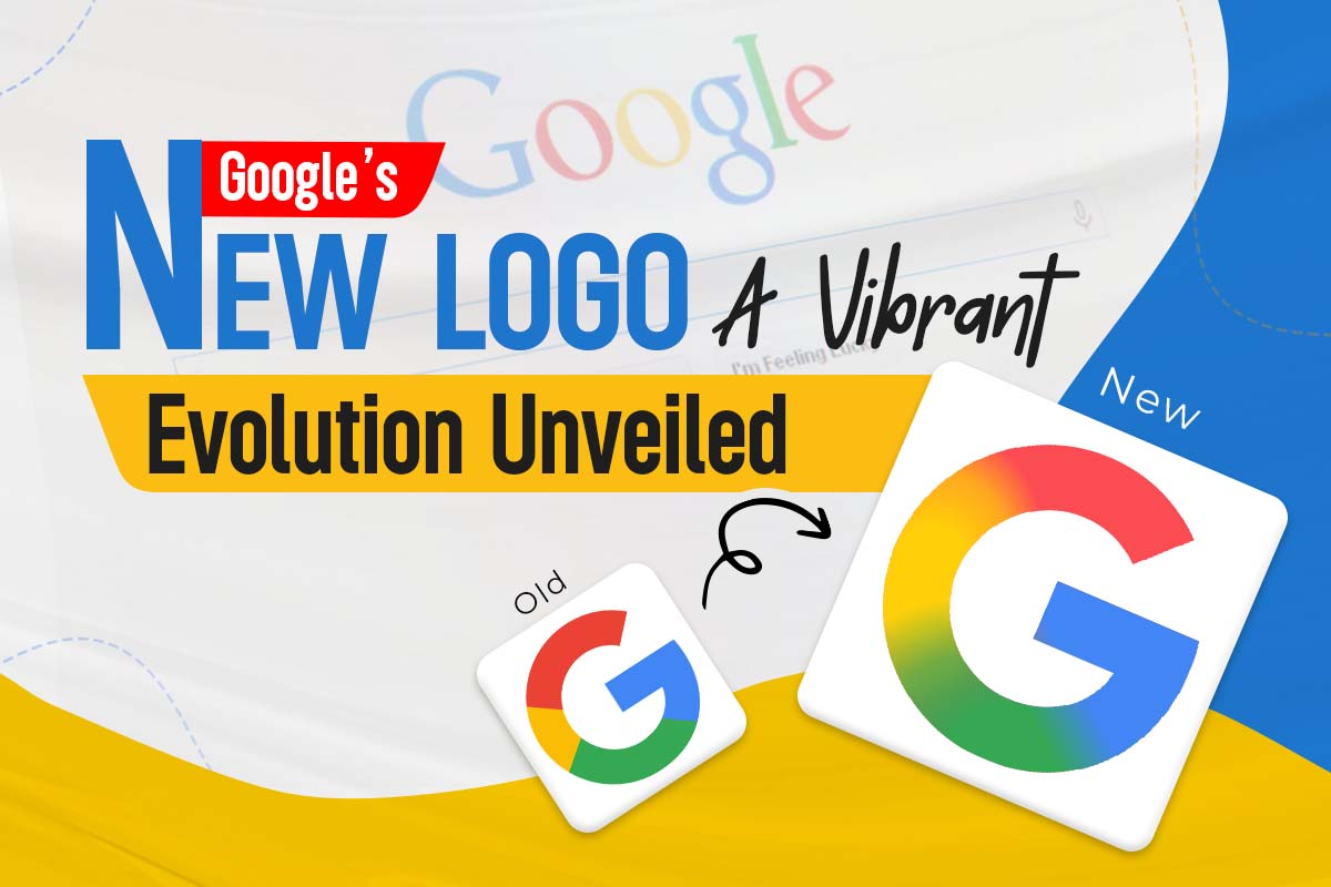
Google has reimagined its iconic G. A subtle shift, yet a striking move. This update speaks to bold vision and creative intent. The tech and design world is buzzing with admiration.
A Fresh Look for a New Era
The updated logo made a quiet debut on iOS and Pixel. Gone are the flat color blocks. In their place flows a vivid gradient. It echoes the spirit of Gemini and other smart innovations. The new look feels alive. It feels warm. It feels ready for the future.
- Gradient Magic: Colors blend effortlessly to create a soft, modern essence
- Subtle Refinement: Fine-tuned curves and sleek proportions boost clarity
- AI Alignment: A visual harmony with Google’s growing AI ecosystem
Why the Change Matters
This is more than visual polish. It signals a new chapter. A shift from static design to flowing identity. It mirrors Google’s trailblazing role in AI and search.
- Modern Appeal: A fresh design that clicks with a younger digital generation
- Brand Consistency: Unites Google’s vast product range under one visual thread
- User Connection: Softer edges make it feel closer and more relatable
A Seamless Rollout
The reveal was subtle and purposeful. Users noticed it on their own. Already live on the iOS Search app. Now rolling out across Android. A quiet launch that shows confidence in the logo’s strength.
- Cross-Platform Presence: Appearing across devices, web, and apps
- User-Friendly Design: Seamlessly adapts to both light and dark settings
- Global Reach: Built to resonate across cultures and screens
What’s Next for Google’s Brand?
This logo marks the start of something more. As Google expands deeper into AI and cloud innovation, its identity will keep evolving. The new G is a bold step toward a unified future.
- Future-Ready: Crafted for the tech transformations ahead
- Inspiration for Designers: A refined blueprint for minimalist identity
- User Engagement: Sparks curiosity for what Google is building next
Final Thoughts
This isn’t just a new logo. It’s a symbol of momentum. With gentle gradients and graceful form, it captures Google’s evolving story. As it spreads across the digital world, it invites attention and admiration. A sign of change in full motion.
Views (5)
Comments (0)
Duration (0)


.jpeg)


Comments (0)
Write a Comment